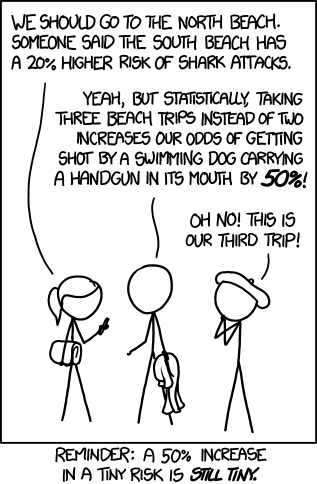
Statistics can be very tricky to interpret. In the news, in medicine, and in research, statistics are often bent to convey an interpretation of the data. I used to think that data was pure and unadulterated, but in a world where persuasion is everything, this is not the case. For example, consider a very rare cancer that happens in one in a million people. Say a new medication reduced that occurrence to one in two million people. Proponents of that medicine will claim that it halves the rate of the cancer, which is true. But opponents of the drug may say that it reduces the rate of cancer from 0.0001% to 0.00005%, which is also true. But the first statement makes it look like a much bigger difference than the second statement. This is one simple way that the reporting of statistics can be used to bias readers. A recent xkcd comic highlighted that for me.
Image is from xkcd, drawn by Randall Munroe, shown under Creative Commons Attribution License.
Subscribe to:
Post Comments (Atom)


No comments:
Post a Comment